As we get closer to finishing SODO EXPRESS, we’re taking the time to chat to a few of the crew involved in the film and the process behind their roles.

What’s the concept for the titles / credits?
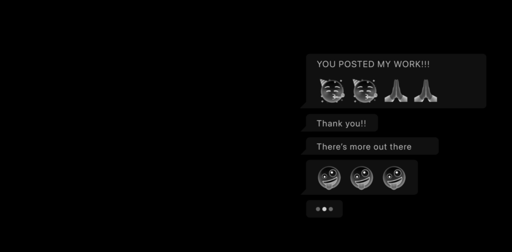
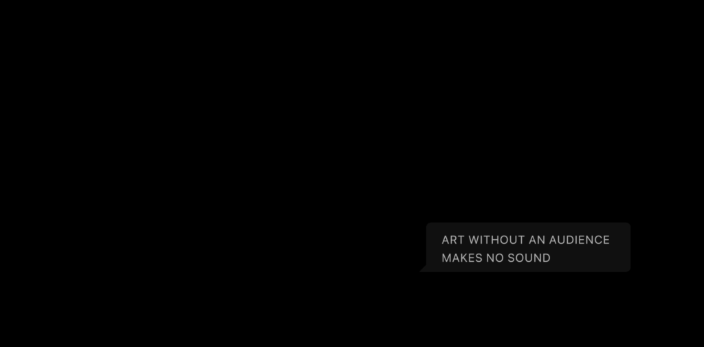
The brief was to create a simple typography based treatment that will convey the mechanism of social media. We looked at ways in which we communicate via social media and tried to incorporate that into the how section titles and end credits are displayed.
Have you looked at any other references? Anything you like / dislike?
I didn’t have a particular reference for this concept apart from What’sApp on my own phone. I wanted the movement and position of design assets to be true to the real thing and generic looking as possible so that it would draw more attention towards the conversation that is taking place.
There is fun in remixing every day user interfaces that we take for granted.

How are you going about executing this?
I was inspired by the way we communicate via What’s App and the way their UI is optimised to keep users engaged by clever use of ‘incoming message’ dots etc. The experiment is to introduce this sense of anticipation into the film and the end credits and see if we can keep the audience hooked.

Any ideas about audio yet?
Our friend Matt Rudge aka IXA is working with us on the audio design for Sodo Express and it would be great if he can work his magic on the title credits and graphical bits and pieces. I think we’ll keep the audio pretty simple and realistic.
With a minimalist concept like this it’s difficult to ‘ramp things up’ if it feels underwhelming. We can’t add colour and we have to keep the design fundamentally the same as a generic text messenger UI. But hopefully because of these restrictions the subtle things will have more of an effect, like inverting the hue of the emoji icons so it looks very familiar yet strangely haunting.

Any other issues can you see coming up?
I think the concept could turn out to be a bit underwhelming as it’s not really a visual spectacle. But I’m hoping my clever uses of emojis will help solve this problem!


Is there anything you would have loved to do on these titles and graphics?
I think the concept itself is something that doesn’t require a huge budget to execute which is perfect for a low budget short film like Sodo Express. I think the beauty is in the fact that, it is a low budget concept and the challenge is that any shortcomings can’t be patched up with eye catching motion graphics.
Simplicity is king!

If I had more time it would be fun to experiment more with how this concept could be applied to other parts of the film, and how this kind of graphic device could integrate into film and help the narrative.
Perhaps we’ll keep that for the next film.
If you are interested in reading more about our film SODO EXPRESS, go check it’s own page here and if you’re up for collaborating with us please do book a free consultation right here.
